The Art of Mixing Patterns and Textures in Interior Designs
Incorporating a mix of patterns and textures adds depth, interest, and personality to a room. While this can be a challenge for many homeowners, when done well, it can create a beautifully curated space that reflects the homeowner’s style. The key to successful pattern mixing is to balance scale and color to ensure that the varying designs complement each other. Incorporate contrasting textures by pairing rough with smooth materials or matte with glossy finishes to engage the senses.
Scale and Balance
When incorporating patterns into your interior design, it’s essential to understand the difference between scale and proportion. Scale refers to size, whereas proportion is how an element looks at its environment. For example, a large-scale pattern like herringbone or chevron can overwhelm smaller rooms. To counter this, pair it with a smaller, more organic pattern, such as a zigzag or gingham, on throw pillows or area rug accents. In addition to size, it’s also a good idea to mix patterns of different styles. This will add visual interest and prevent your space from feeling cluttered or chaotic. Lastly, when choosing a dominant pattern, select one with an intense color or a bold texture. This will set the tone for your entire room and help to guide your other pattern choices.
Contrast
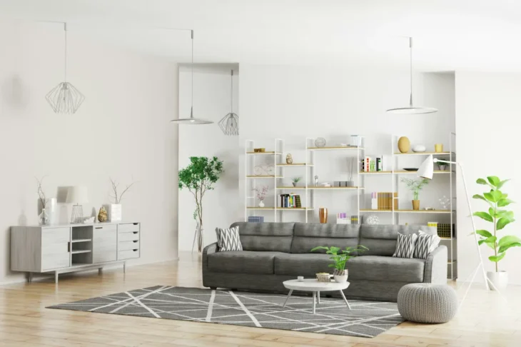
Mixing patterns and textures is an exciting way for top interior designers to add depth, visual interest, and personality to a space. But it’s essential to understand how to do it properly to avoid creating a visually overwhelming design. Contrast is using opposite or vastly different elements to add depth and visual interest to a room. This can be achieved through various aspects, including color, shape, texture, and size. For example, a complementary color scheme (on opposite ends of the color wheel) can create a strong contrast. Similarly, combining textures like smooth leather with rough wood or linen can create an exciting and eye-catching contrast. This can also be done by utilizing different scales of patterns or adding different textures to the same room.
Complementary Hues
A color scheme provides a foundation for any design style and can act as a guide when mixing patterns and textures. Choosing complementary hues that harmonize is one of the most important factors when creating a harmonious look. Analogous schemes use colors adjacent to each other on the color wheel for a calming effect. Complementary colors, found opposite each other on the color wheel, create a vibrant look. The yellow and red in this room’s patterned upholstery and accent pillows exemplify a traditional, complementary color scheme. Try a split complementary color scheme for a more modern take on complementary color schemes. This color palette uses one primary shade and two shades from each side of its complement to create a warm, dynamic design. For example, this living room’s yellow upholstered chair and blue-violet accent pillows utilize a split complementary color scheme.
Focal Point
Whether it’s a bold carpet, a unique piece of furniture, or a natural feature, a focal point can pull the eye into a room. Focal points can set a space theme, create drama and even make a small room feel larger. Creating focal points is an easy way to add style and character to a home. The most effective focal points are strikingly distinctive and eye-catching yet still complement the rest of a room’s design scheme. Using a color palette and applying patterns with varying scales are two foolproof ways to mix textures and prints. Also, incorporating one or two complementary colors in a patterned print can help balance the overall look. For example, pulling the leaf green from a floral pattern and using it as the primary color of another print will bring harmony to your space.